A profitable blog will be extremely useful, practical and easy at first sight even to a new visitor and minimal. This is a comprehensive post that will serve as a one-stop simple best blog layout design guide for beginner bloggers as well as established bloggers looking for a more profitable redesign.
Let’s get started!
One Column vs. Two Column vs. Three Column
Choosing the columns is the base of your blog layout design and you can’t change your theme every other day. You choose the number of columns based upon your requirements.
One column layout
Distraction-free reading, lower bounce rate, higher conversion rate, great for sales pages, recommended for mobile, this is a preferred mobile friendly best blog design and layout for single posts you’d notice in several blogs these days, the layout is yet to be adopted by blogging community.
Two column blog layout idea
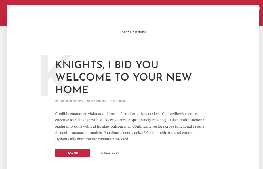
This is the most common and practically used by a large number of blogs. The readers gets the choice to navigate to another post and blog areas quickly from the sidebar. The sidebar has a room to show featured, popular and latest posts, tag clouds and even social media streams. Without disrupting the readability, it allows you to put a subscription pitch as well. This two-column layout is one of the best blog design practices and is profitable because the sidebar allows advertisement space.

Three column blog layout idea
This is a rare and scarcely used layout for blogs. The early days blogs used three column layout. The main aim is to show the primary content of your blog or website all the time while the visitor is navigating. It works well for ecmmerce website where you have your categories listed on left sidebar.
For blogs, one can use this 3rd column to show the most useful and profitable guides and pages. It also gives space for a few more advertisements. However, 3 column layout is practical only for desktops. These days, over 70% of the users come from mobile, so 3 column layout isn’t as functional as it seems. The only flip side is the clumsy looks.
What is recommended?
Try a two column layout first.
Readers’ Choice: Best WordPress Themes for Bloggers & Coaches
Magazine vs. Minimal
Magazine layout is trending in the last two years. It looks rich and sexy. That doesn’t mean you should follow the trend. Let’s look at some practical uses so you can make the right decision for your blog.
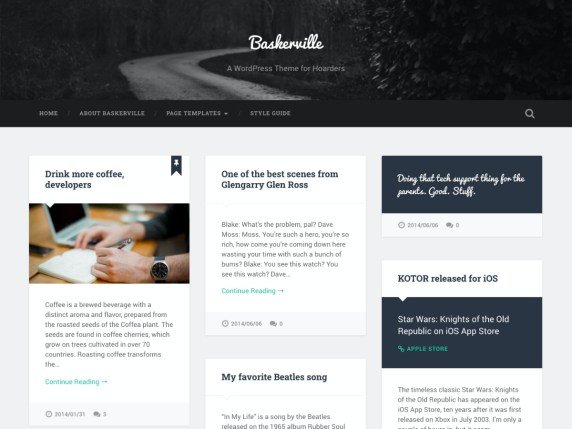
Magazine Style Blog Layout Design
Works great when you have a multi-niche blog writing about several subjects, for a multi-author site, a blog that’s updated almost daily and can show a lot of content. Having a magazine layout works well when you have a lot of media content like videos, visuals to share. When you have a journalistic writing style, It gives 10 times more space for advertisements with different sizes and placements.

Simple minimal blog layout Idea
Works perfect for the beginner bloggers writing about specific or a few subjects in one niche, the focus is on more readership, visitors and less on advertisement, when you’re not posting every day, works great for personal and single owner blogs, the minimal look appeals the audience and doesn’t feel overwhelming. Creates an instant personal connect because of first person writing style.
What is recommended? – For personal new bloggers – try simple minimal blog layout, For multi-author or multi-subject brand goal – try magazine layout.
Light vs. Dark Color Scheme
Light is soothing, relaxing. Dark is exciting and glamourous.
It’s important to choose the right color scheme for your blog. You choose the theme based upon;
Your audience
Your subject
Your goal
Your own personal preference
Dark theme
For sensitive, specific, and thought-provoking subjects, having a dark theme works well to highlight a brand. The audience gets connected as soon as they land on your blog. The choice of color scheme also reflects your personality to the new readers and visitors who don’t know you personally yet. Works well for the subjects where you’re looking for a reader’s active participation.
Dark and black color scheme gives more specific, private, luxury and exclusive look.
Examples – Best blog design practices and idea for gaming, social issues subjects
Light theme
Light color scheme for a blog attracts larger audience. It’s more welcoming and refreshing. Works great for practically every subject where a user needs help, wants to relax and visiting Internet to take a break. Choosing a white or light color scheme gives space to every color or element to stand out. The light color alone itself stands out with minimum content. Over 80% of the blogs and websites use light theme, so we can say, it’s the best blog design practice among bloggers but makes it an ordinary choice as well.
White gives more minimal, spacious, common and expanded look.
As per ProBlogger, 47% of participants (majority) said they prefer light themes over dark.
What is recommended?
Light theme. However, decide based upon how you want your readers to feel? Most of the blog templates and themes come with both light and dark color scheme choices.
Blog vs. Website+Blog
What is the difference between a blog and a website and a website+blog
On a blog, the visitor sees the regularly updated page with recent or well-organized posts in a list or magazine-style. It has a few information pages such as about, offering and contact etc.
A website’s landing page (s) is all about the brand, how it helps and it’s services. It may or may not have regularly updated sections or news area.
A website + blog experiments with layout. It mainly focuses on a landing page that talks about the brand, what it does and then displays the latest or featured blogposts with an option to read the rest of the posts on a dedicated blog area. This is a popular layout these days.
What is recommended?
Unless you have your own products, services and courses to sell, prefer a simple blog layout with latest posts showing up on your homepage.
No matter what blog layout idea and design you choose based upon the above given scenarios and preferences, a great blog will have the following key elements:
- Logo
- Main navigation with essential pages (vertical or horizontal)
- Latest blogposts stream
- Sidebar
- Call to subscribe
- Advertisement space
- Footer
- Copyright bar
The best practices for a perfect single blogpost involves
- Post Title
- Feature Blog Image
- Author and date [optional]
- Main content & text body
- In-text advertisements [optional]
- Related posts
- Call to subscribe
- Sidebar [or underpost area for one column layout]
- Comment box
- comments
- [Header & Footer is universal blogwide]
Essential Money pages of a blog
Start Here – Read this guide to create great start here page
Bio – Read this guide to write a perfect bio
Contact page
Media Kit/Advertise – Read this guide to create a great media kit
Resources – Download free blogging and social media resources and bundles
Recommendations – Use it to showcase your best recommendations and add your affiliate links
That’s all from me. Now, it’s your turn to ask questions or write your experiences and suggestions in comments.
When choosing a layout, give a good thought to your goals, audience and minimum thought to what you love. The money comes from your visitors. So, it should be the best fit for them to visit and stay on your blog and subscribe so they keep coming. That doesn’t mean you should ignore your choice. Just be reasonable and focus on the best blog design practices and layout that works for everyone, makes money for you and makes your blog popular in the community.
All the best
Sunita Biddu is a digital business coach and power blogging mentor helping coaches and small business owners. She helps with building a strong and profitable online presence and reputation that creates a self-sustaining business. Sunita writes on this blog once a week about easy-to-use guides and articles about business, coaching, social media and blogging. You can grab some of her free resources and ebooks from the resources section.
Comments are closed.